GOV.UK visual identity and brand

GOV.UK visual identity and brand
Lead designer for Government Digital Service
2012 — 2013
In 2012, there were a lot of ideas and aspirations for GOV.UK, but fewer ideas of how to translate that into a brand language.
Constraints can lead to creativity, and we had a lot of constraints. It couldn’t conflict with existing UK government brand guidelines, but it had to be much more distinctive than they were. That wasn’t just an aesthetic concern: it was a way to protect GOV.UK against scam sites that mimic it. It needed to be flexible enough that designers with a range of skills and experience could implement it. And it needed to not alienate the 49% or so of people in the UK who vehemently disagree with whatever party is currently in power.
I was interested in how the design language could be distinctive without being jingoistic, evoking the infrastructure of the state instead of the politics of the present. Striking that balance was especially challenging around the London 2012 Olympics. They were fun to attend, but they were also a dayglo sticky-plaster over the UK’s deep-rooted divisions. Design doesn’t change how people feel about government or how it treats them — but it can make it easier for people to interact with public services, by fading into the background.
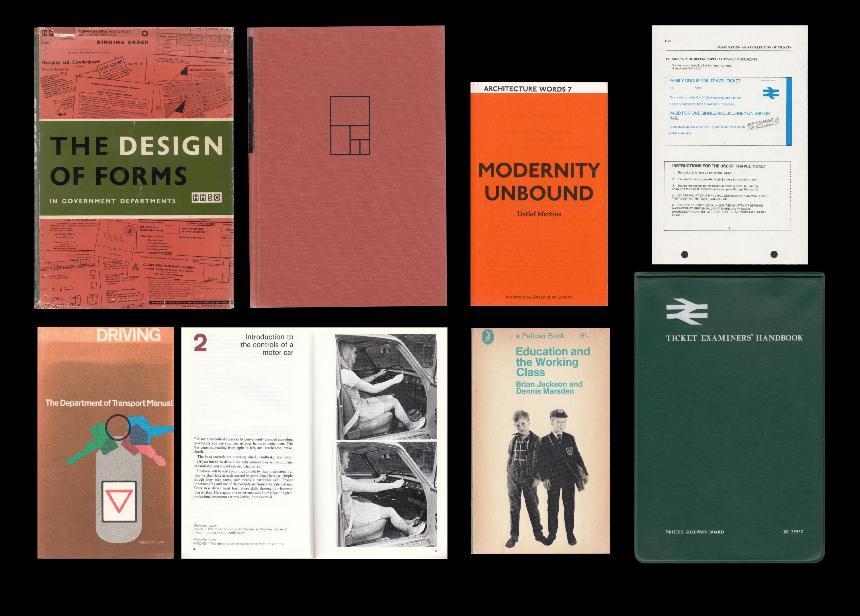
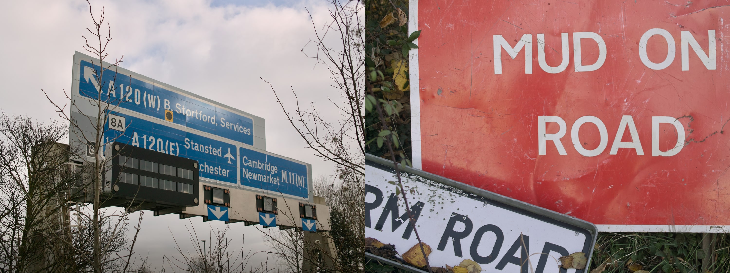
We were working at speed, across many agile teams and with very little formal coordination. Unlike my experiences on GEL, there wasn’t a dedicated branding workstream for GOV.UK. With almost a decade’s hindsight, I pushed back against a lot of not-very-good ideas. Especially for potential typefaces. Doing desk research for the Design Principles, I’d come across Calvert and Kinneir’s Design Research Unit (DRU), which got me thinking about the road sign system. It worked. It was tested, rigorous, designed to be used in high-stakes situations and could be adapted by a range of craftspeople.
Paul Annett had a similar idea during the prototyping alpha stage but hadn’t found a version of Transport (the road sign typeface) that rendered well on screen. Using our personal credit cards, myself and Ben Terrett bought every DRU-related font we could find. They all rendered terribly too. I’d even started redrawing Transport myself when Ben heard that Henrik Kubel at A2-Type was working on a redrawing with Margaret Calvert. And Henrik sent us their work-in-progress files.
They were great. Within an hour I was committed.
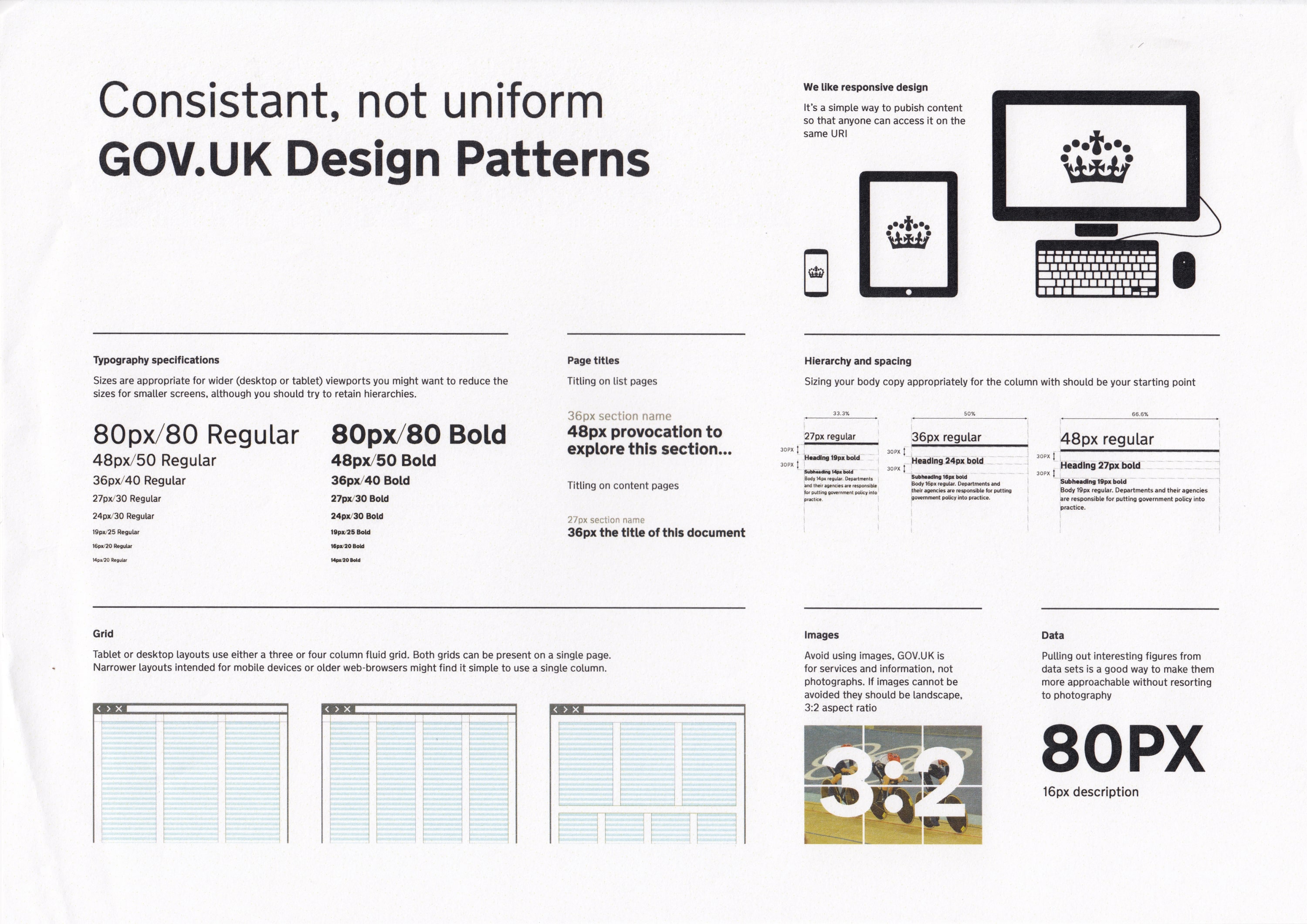
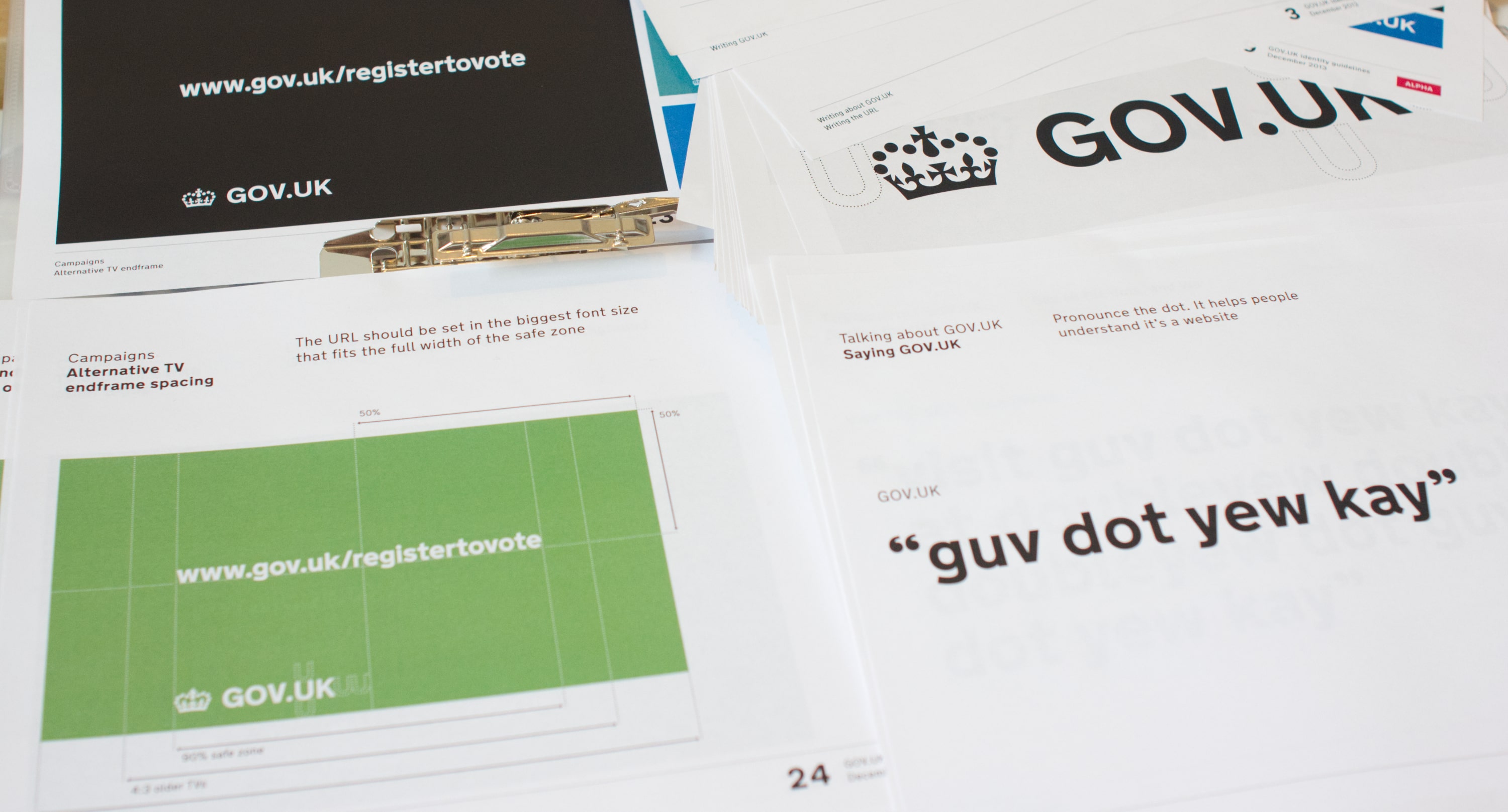
Using New Transport (and later, GDS Transport), I designed the web typography scales, colours, grids, page hierarchies and basic brand elements. The pace of development for GOV.UK didn’t allow much time for finessing details. Unlike GEL (where I defined tight whitespace measures on a rigid grid), I used generous whitespace based proportionally on the header sizes (which masked the lack of consistency between pages). I put all of that into a shared SASS file. This allowed designers working across GOV.UK to collaborate using the same core elements, even as our development teams worked autonomously from each other. I also worked with Beeker Northam, with Russell Davies’s direction, to define the brand language and formalise the logo.
The GOV.UK brand language was praised for being modern and won a host of awards. It mostly avoided controversy, though predictably — and repeating their reaction to GEL — the rightwing tabloid Daily Mail disliked it.
An unexpected but welcome side-effect of using New Transport on GOV.UK was a public reappraisal of Margaret Calvert’s career and impact on UK public life, including her going on TV show Top Gear. In 2019, Untitled Goose Game (the top reviewed game of the year) was set in a generic English village, with the UI set in New Transport and the GOV.UK brand colours. See also: GOV.UK beta to live and the GOV.UK Design System
Design direction from Russell Davies and Ben Terrett, creative direction from Beeker Northam, designed with Paul Annett, Henry Hadlow, Stephen McCarthy, and Guy Moorhouse collaborating across multiple agile teams. GDS Transport by Henrik Kubel at A2Type, and design feedback from Margaret Calvert.