GOV.UK beta to live
GOV.UK beta to live
Lead product designer for Government Digital Service
2012 — 2015
Before GOV.UK, the UK government had 1000+ websites, run by more than 500 organisations. With their own branding and layouts, they competed in search results, shared conflicting information and were vulnerable to fraud. Obviously, the user experience was awful. Developing and maintaining all those websites and brands was expensive, not to mention the time and cost of pushing even minor updates across the fleet.
There was also a subtler challenge. Decades of knee-jerk outsourcing meant a lot of government computing was a byword for expensive incompetence. Government IT failures were mainstays of slow news days, providing the press with an ongoing, undermining rumble that the UK Civil Service could not be trusted to run services for citizens.
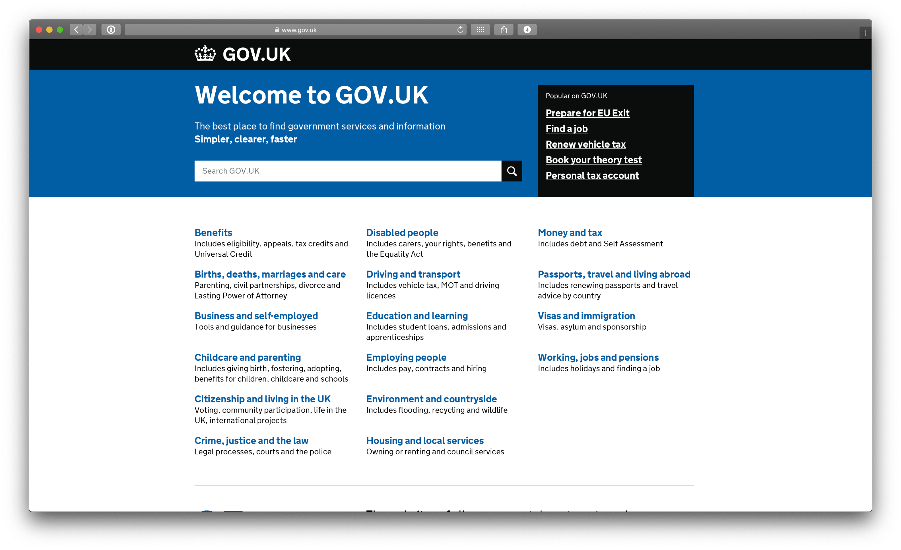
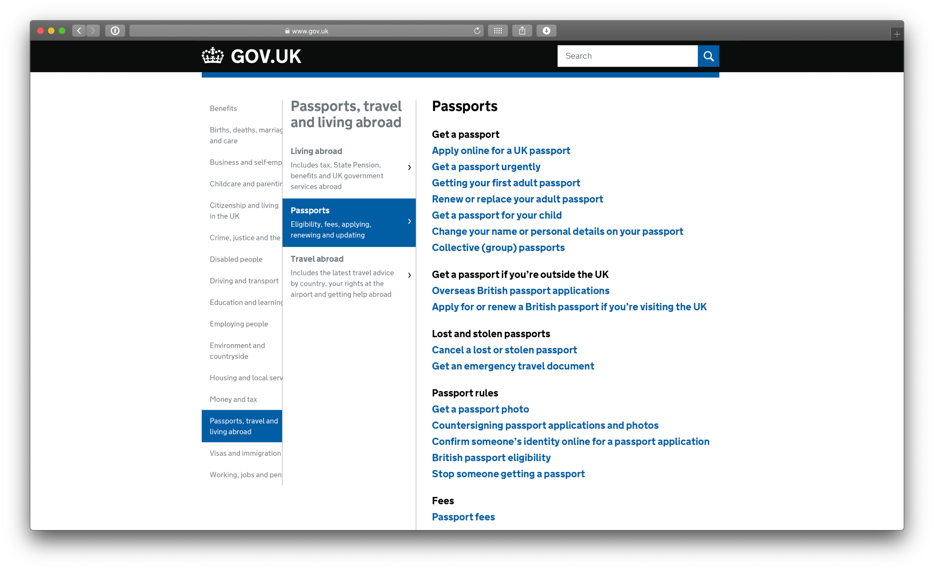
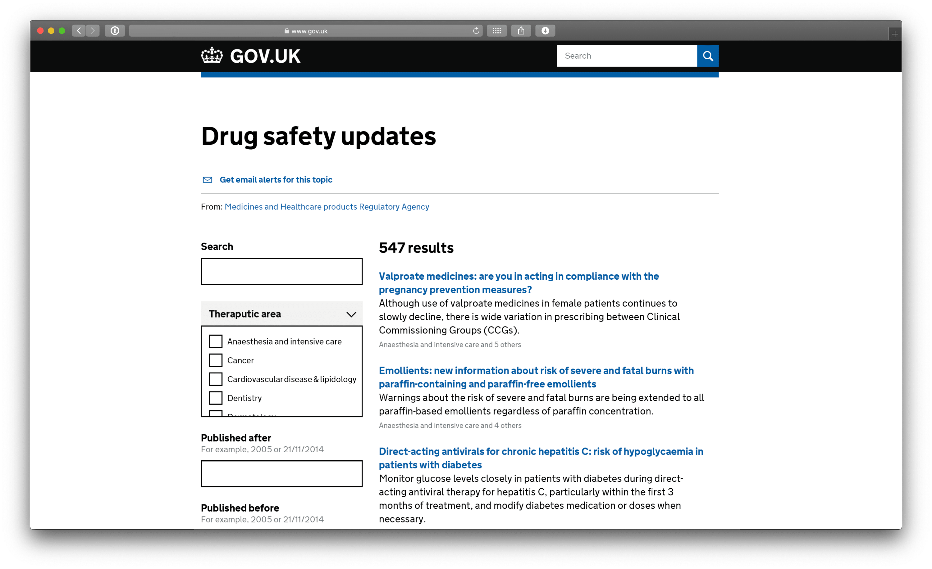
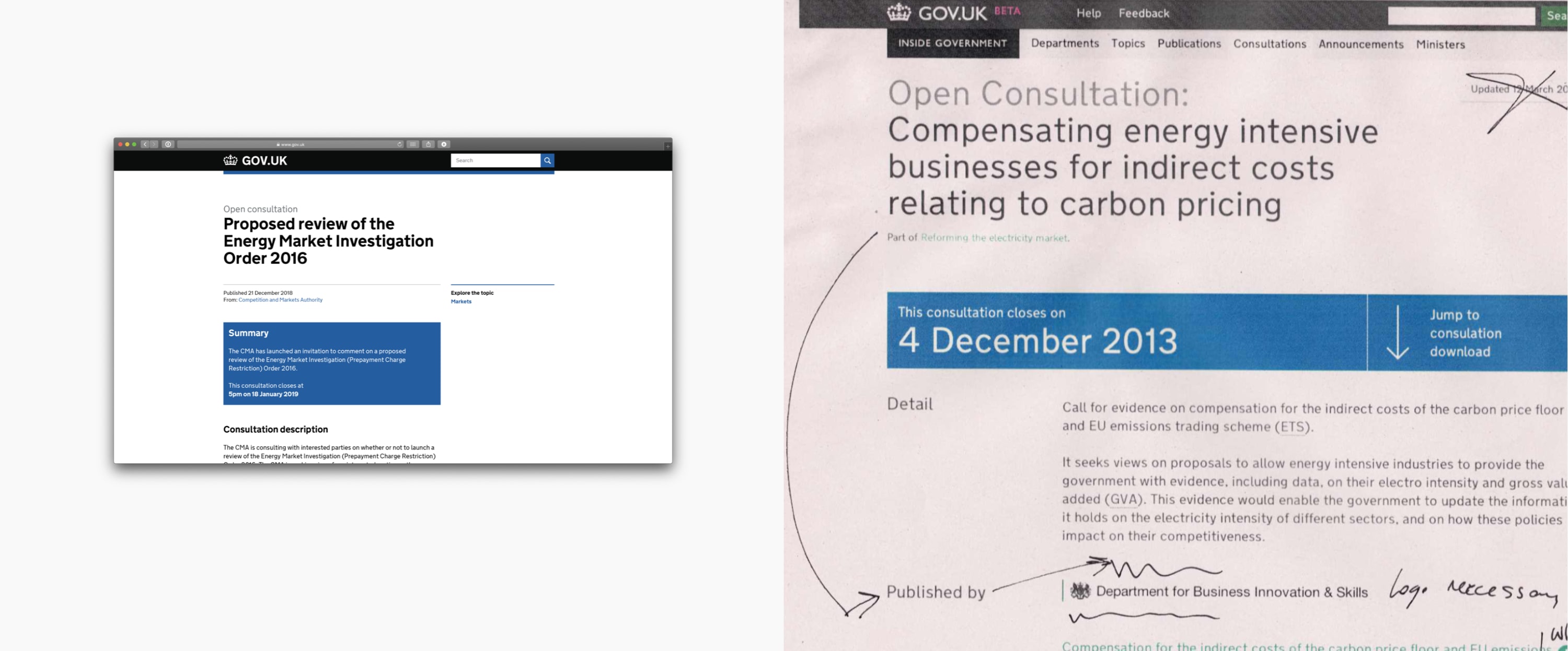
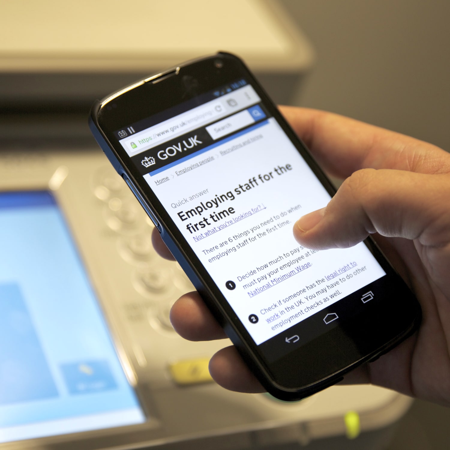
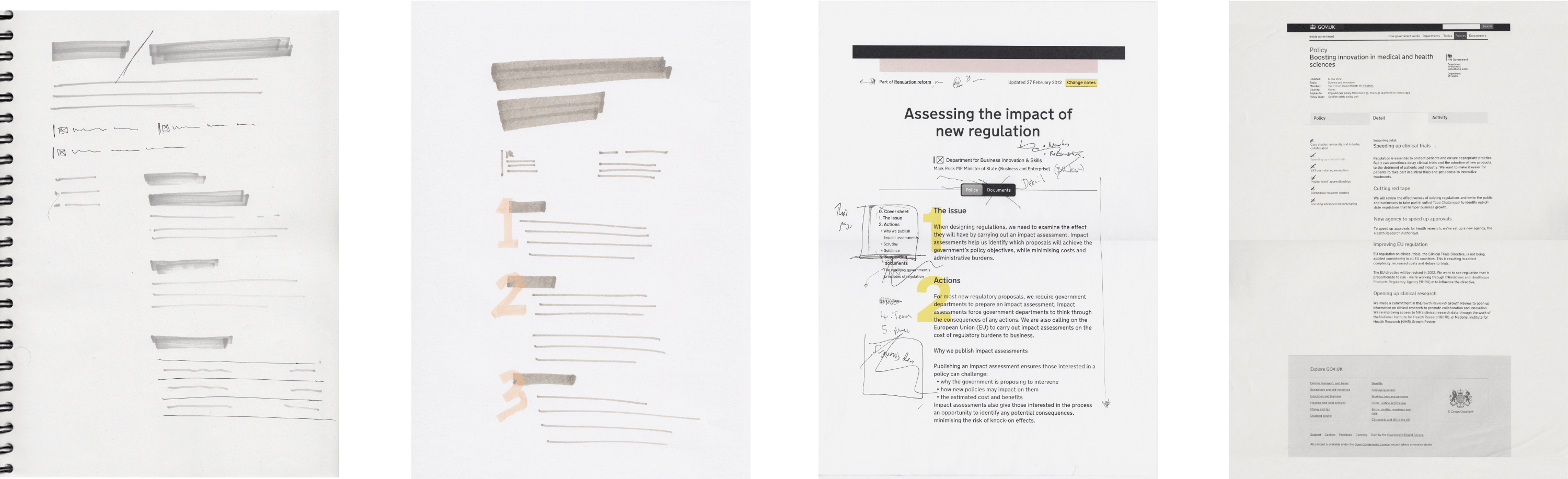
I tell people that there’s only two design briefs: “sell more stuff” or “make it cheaper”. GOV.UK was the latter. But within that, we had plenty of scope to make it better too. We built and designed a single UK government website and brand to replace all the existing ones. Fully accessible, trustworthy and responsive. We brought together more than half a million content pages, full lists of ministers and homepages for all departments, launching a new way to design what national institutions look like on the internet.
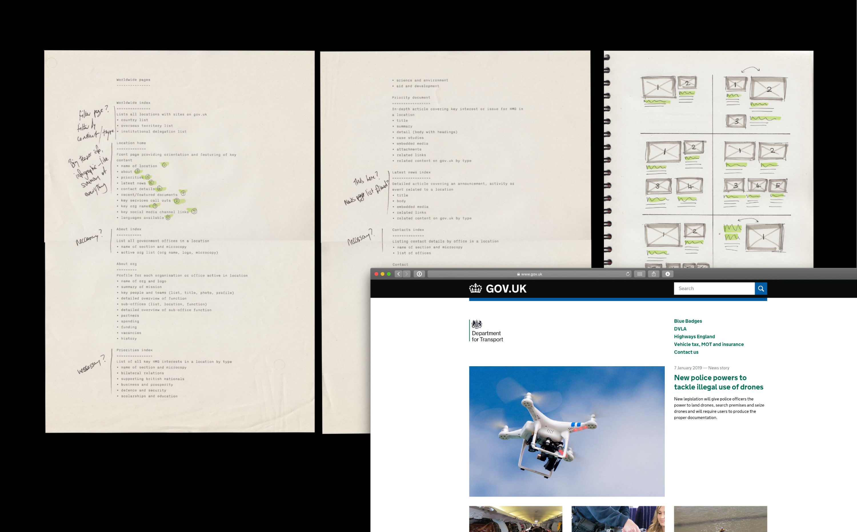
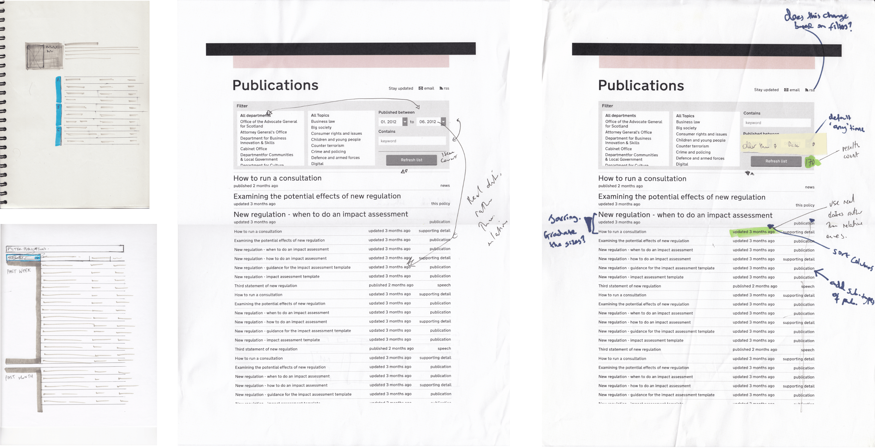
I joined the newly set up Government Digital Service when they’d made a clickable prototype, and were starting work on the real thing. Initially I led the design of the “Whitehall” section of GOV.UK, including 98% of the content pages, all the departmental homepages, minister profiles, search and navigation etc. After a couple years that expanded to the whole programme. I worked directly with the lead product managers and technical architects to prioritise and define features and architecture, design pages, and worked with developers to create front-end strategies.
On launch day, we were mainly relieved that GOV.UK went live on time and didn’t fall over. It went on to win the Design Museum’s Design of the Year award, beating the designs for Olympic cauldron. It also won D&AD Black and Yellow pencils. Governments around the world have imitated the design, it saved millions of pounds, and is widely praised for its clarity and accessibility. See also: GOV.UK identity and brand and the GOV.UK design principles
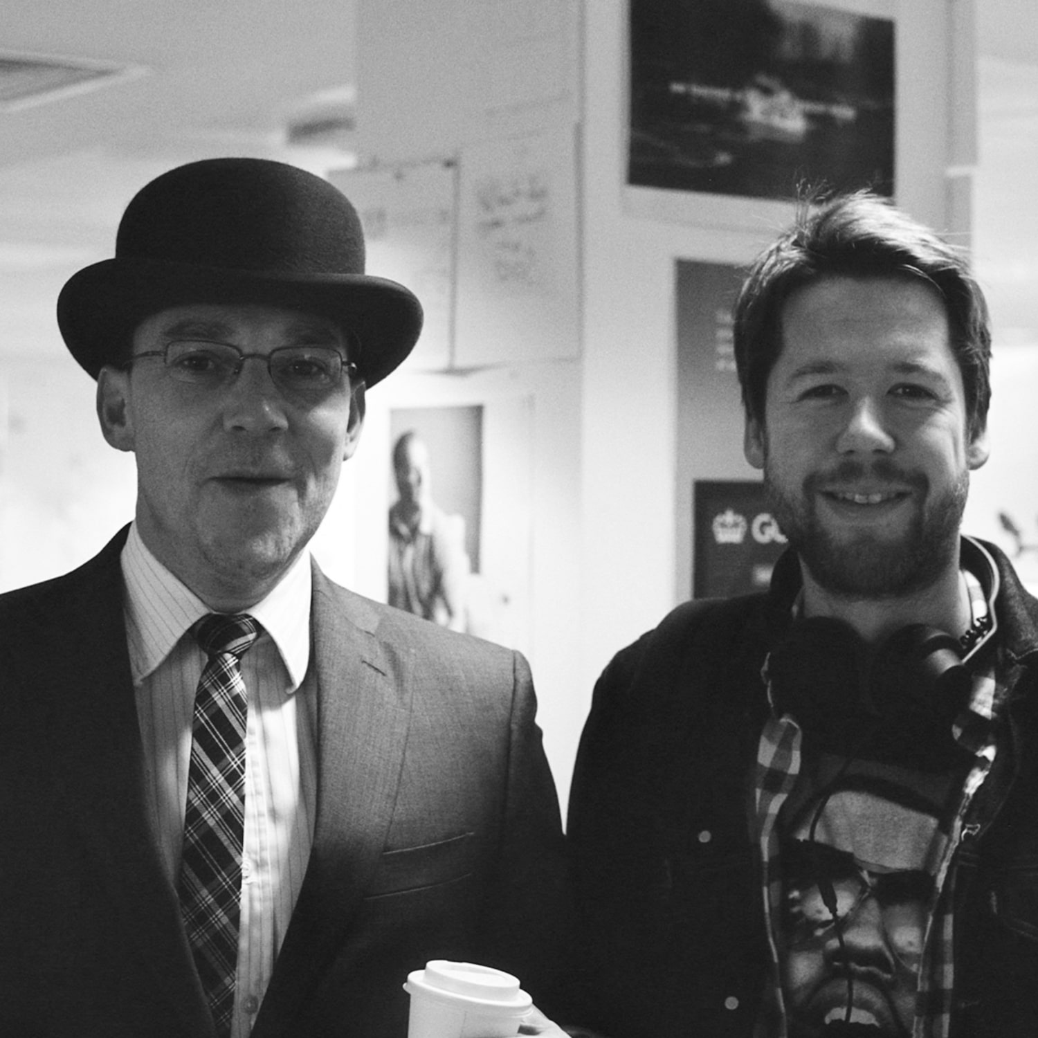
Designed with Henry Hadlow, Chris Heathcote, Ed Horsford, Stephen McCarthy, Guy Moorhouse, Tim Paul, Michael Thomas and Amy Whitney collaborating across multiple agile teams. Based on prototypes by Paul Annett, Frances Berriman, Max Gadney, Richard Pope, James Weiner and the team at Go Free Range. Design direction from Russell Davies, Sarah Richards and Ben Terrett.