Experiments in programmatic art direction
One of the weirdest parts of learning CSS is wrapping your head around the cascade. We abstract and use frameworks and all sorts of stuff trying to control it, to scope our styles and make our webpages look exactly how we want them to. But what about doing the opposite? Instead of going at the cascade like a challenge that needs to be overcome, could be fun to engage with it as a creative programming tool.
It’s something I’ve been interested in for a while. The relative scaling typography system I created for the responsive BBC News website evolved from those ideas, using environment variables (the viewport dimensions) to cascade sizing variables through the interface. Pretty limited, but it was fun.
Didn’t really think about it after 2012 when I started working in government. It’s not remotely appropriate in a public information context, and tbh government has plenty of big problems to keep my brain occupied. Anyway, last month I picked up the Lars Muller reprint of Karl Gerstner Designing Programmes and it started me thinking about some of this stuff again.
Since 2012 we’ve gained a lot of new CSS properties that we’re barely scratching the surface. VH and VW units have codified relative scaling font sizes as a browser default, while CSS grid, variables and widespread SVG support open up huge possibilities. So I spent an afternoon last week having a quick play with something. Exploring the grain, as Frank would call it.
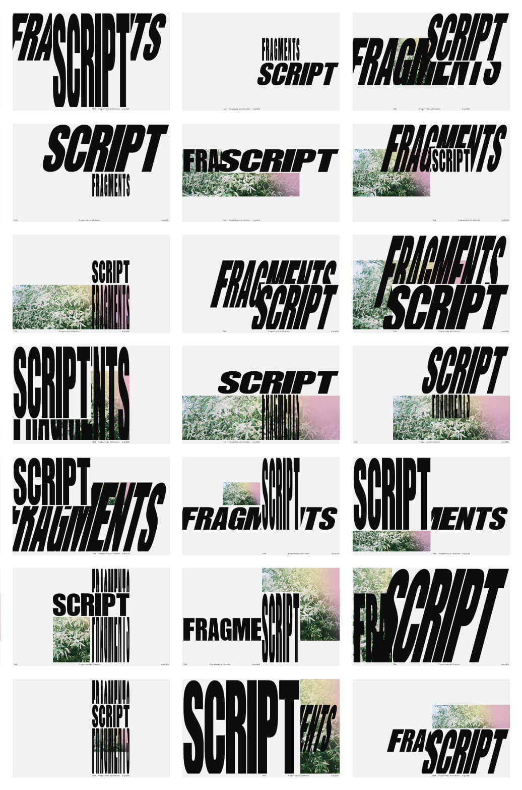
OK, so what the fuck is this?
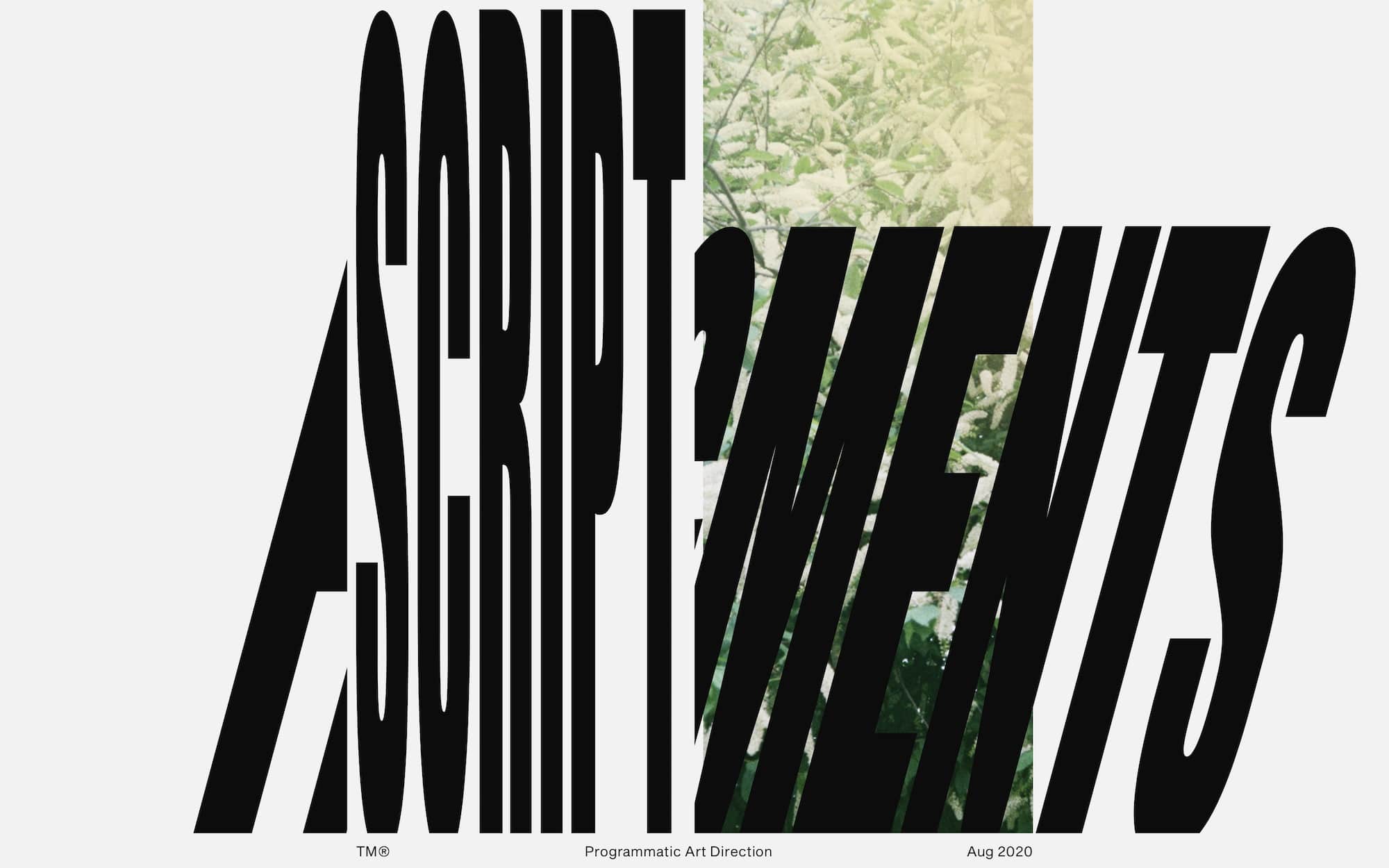
It’s a grid of screenshots I took of a basic progammatic art direction exercise. The programme consists of two parts
Library:
A complete system of modular layout and style rules
Inputs:
A process of deciding which rules to apply to your HTML elements
Because it’s just a quick proof of concept this uses random numbers generated on pageload as inputs. Again, fun, but probably not super useful beyond, idk, generating a couple thousand advert variants or social media images (or maybe creating a run of unique posters or tshirt graphics?). But I think it could be really cool to use environment variables (device info, time of day, weather) or content information (seriousness, availability of assets like photographs or video) as inputs instead.
And also! I’m using a single color set and some simple transforms to manipulate the type and crudely bend it to the grid, but with time and expertise you could do some fucking wonderful things with generated color pallettes and filters, and with expressive variable fonts.
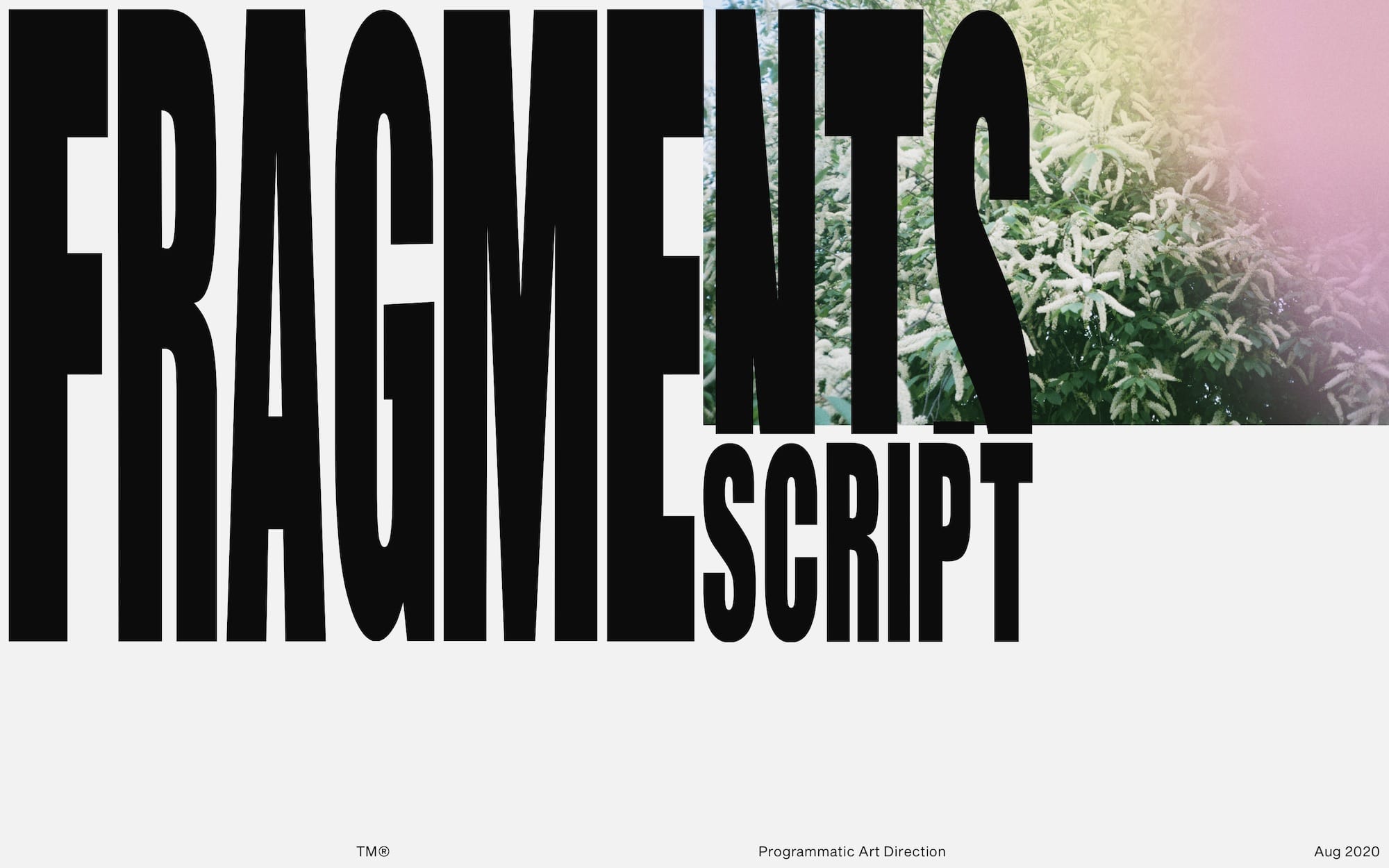
Why would I ever want to do this?
My Facebook feed has totally different content to yours. Plenty of newspaper homepages adapt themselves to your reading habits too. The political adverts I see on my devices contain different promises to the ones you see on your device. And yet you wouldn’t know that to look at them — the content looks identical. It all looks very Dieter Rams, but at the same time obscuring the differences in content doesn’t feel very honest or understandable. Maybe there’s an opportunity to use programmatic editorial design to reflect the values of our programmatically-generated content.
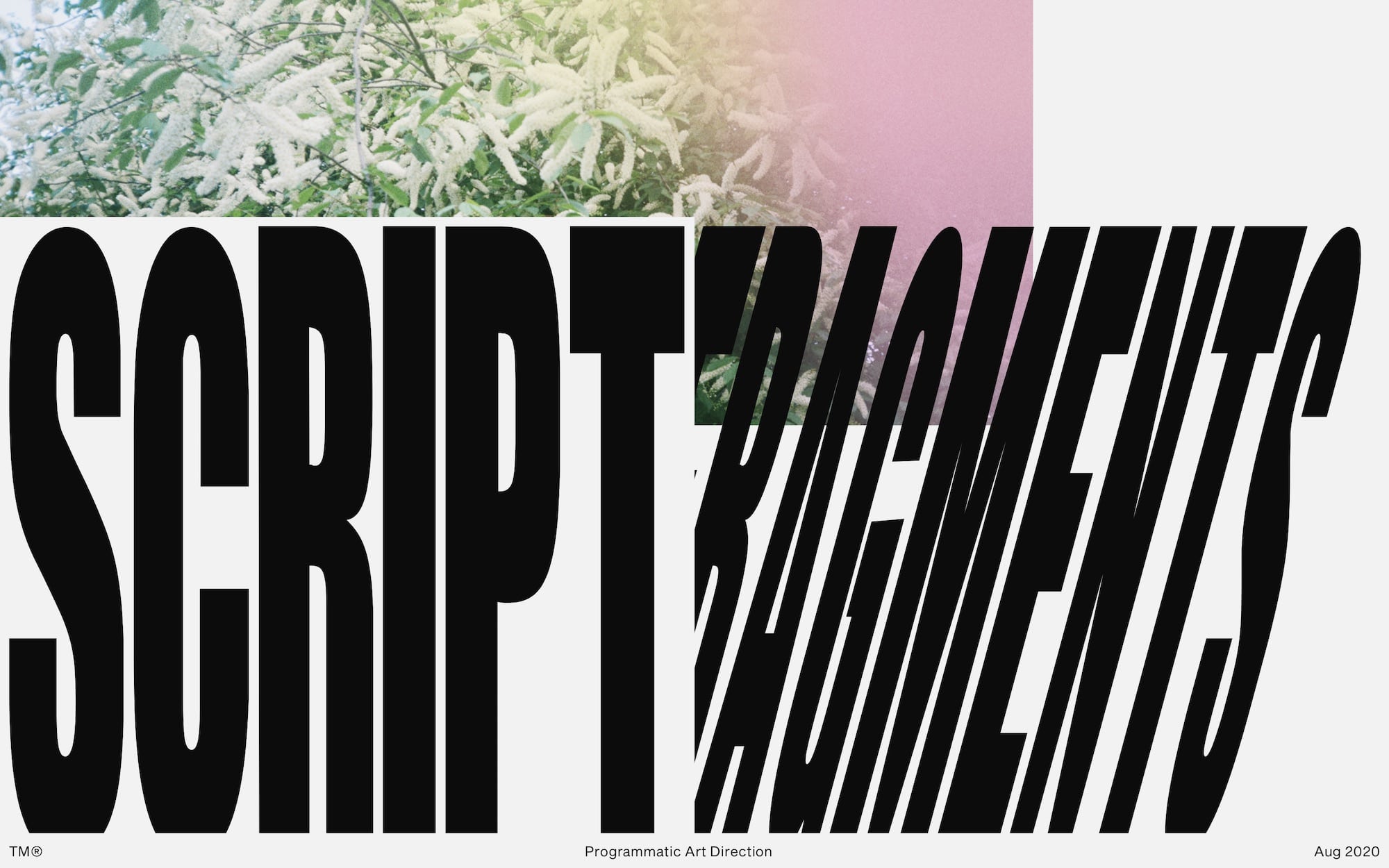
Obviously this is not appropriate for UI design.
Obviously, you won’t try this on important, standardised interactions like logins and card payment processes.
We all know that would be bad.
And yet. So much of the story of CSS so far, from Zen Garden and the Holy Grail through to Bootstrap and React has focused on taming the browser to a few standardised interactions and layouts, to which you can apply or remove “branding” without much consequence. Great for standardised interactions, app interfaces and plenty of other things, but a lot of digital culture doesn’t need (or benefit) from being optimised so much. Sometimes you just want to enjoy reading a thing, you know?
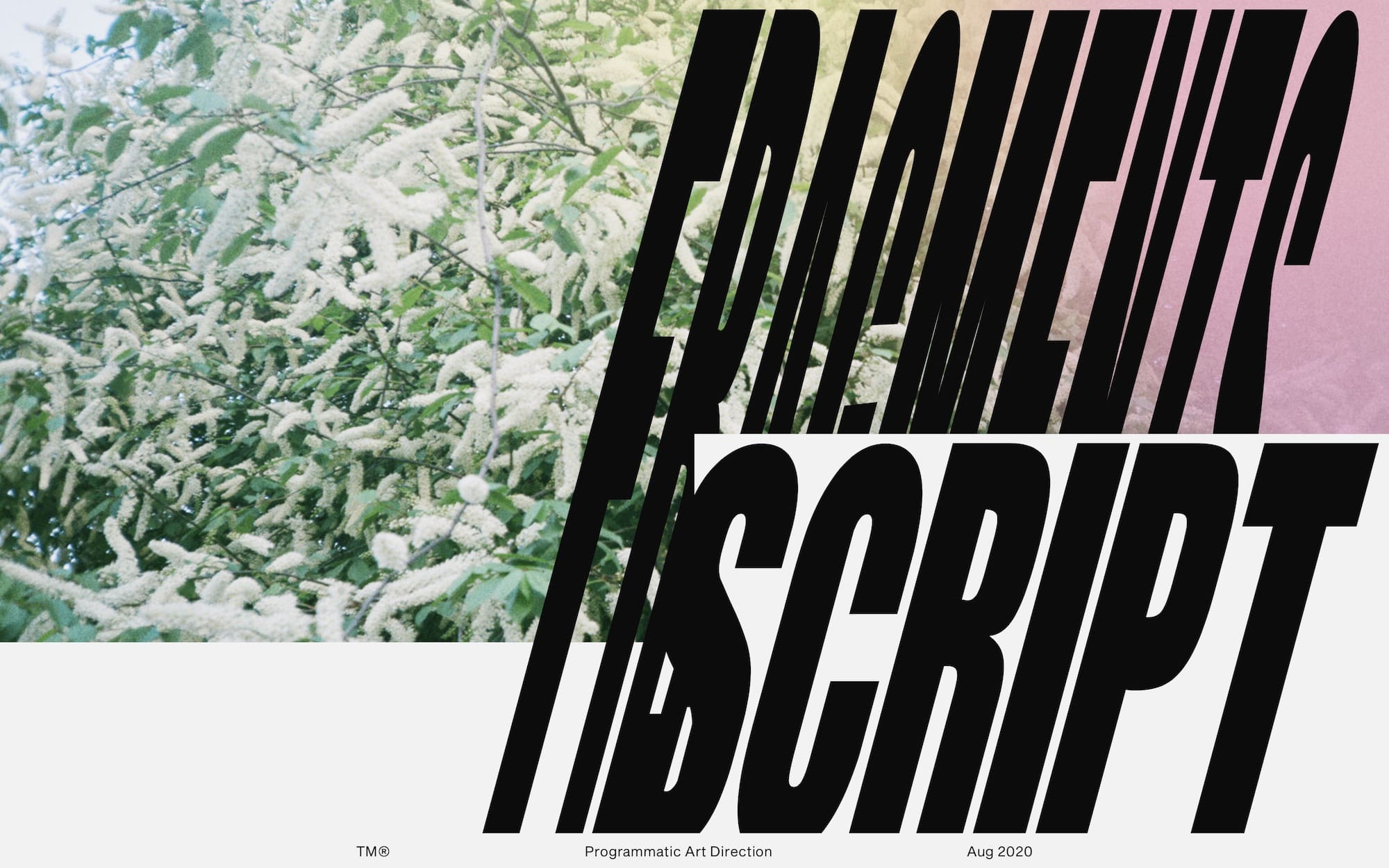
If my New York Times homepage is all lifestyle and celebrity news, but yours is completely finance and politics — should they really look the same? It’s easier to make the website that way, and the brand should be consistant yes, but print processes have adapted over the years to allow art directors to make the reading experience in the printed newpaper reflect the content. Maybe it would be cool if my NYT homepage looked like the magazine section with big photos and expressive type, while yours was all densely-packed columns to reflect your heavy intellectual interests.
One program library with different inputs.
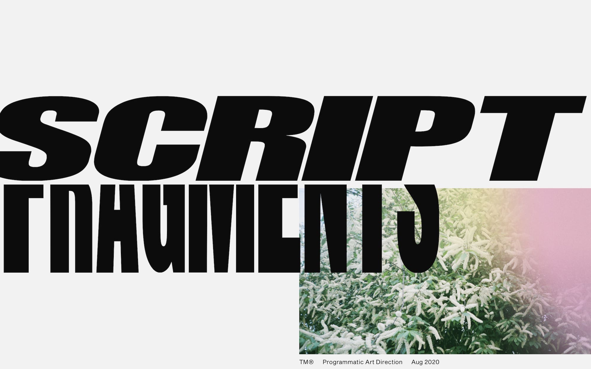
Theres a lot of prior art for designers thinking this way. Grid layouts are like a century old, Designing Programmes (the book I mentioned at the beginning of this post) was first published in 1964, Bruce Mau was creating generative logos when you were still using Myspace and most of your favourite videogames use these programmatic ideas to generate their soundtracks.
Maybe there’s something in it. If there is, it probably shouldn’t be as aggressive as this example. But it’s really fun whatever.
If you want to chat more about stuff like this, send me an email or get in touch on Twitter.
You can pretend it's 2005 and subscribe to my RSS feed