Fluid grids and orientation
Designing for tablets is hard. Designing for tablets with a 16:9 aspect ratio is harder.
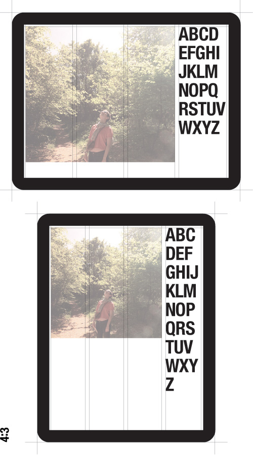
If you’ve created web layouts for the iPad using fluid grids, you’ve seen your perfectly formatted layout change when shifted from landscape orientation to portrait (or vice-versa). This happens because whilst the layout and embedded content (images, video etc) are sized relatively to the pixel width of the viewport, the typography is not.
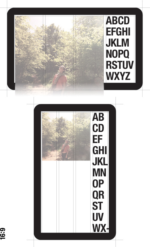
It’s not too hard to design with enough affordance to cope with the variation caused by the iPad’s 4:3 aspect ratio, but most of the Android tablets have 16:9 displays. These displays make the orientation difference even more pronounced.
In this second illustration the photograph is so large that it can’t fit onto a single screen when the device is in landscape orientation, yet the image is small and the text overflowing in portrait mode.
At this point I feel I should make a few disclaimers. I know there is no fold. I understand designing with affordance for the vagueries of CSS text flow and unpredictable content. But it should also be obvious that design variance at this scale is going to affect the visual hierarchy of the page in a significant way.
As I suggested earlier, this issue is caused by the typography being sized absolutely to the viewport rather than relatively to it. Even if we use ems or %s in our CSS to relatively size text, the base font-size (the value which our other font sizes are scaled in relation to) is still an absolute value (‘font-size: 62.5%’ will be 10px no matter what your viewport size is - unless your browser is zoomed). Although I could use a media query to apply a smaller font-size to the text when it’s in portrait orientation, choosing to branch styles might add significant hidden complication and cost for development and QA further down the line.
To style typography that can scale in relation to a fluid grid, we need the ability to specify the base font-size relatively. To express that the font-size for a 960px box should be 150% of the font-size for a 640px box. I suppose it would be simple enough to create this styling with javascript or a gradiated stack of media queries, but it feels like it could (should?) be as simple to set in CSS as setting a layout box to have 50% width.
Something like:
.example {font-size[width="640"]: 10px;}
Whereby when the .example is 640px wide the font-size is 10px, but when the .example is 960px wide the font-size is 15px. Descendent elements would then simply have their font-size set in ems or %s.
If you want to chat more about stuff like this, send me an email or get in touch on Twitter.
You can pretend it's 2005 and subscribe to my RSS feed